
These two ads were 50 feet apart in the 68th Street station on the #6 subway station. Besides both being tagged by a certain Mr. "Tasty," they share the use of overlapping color layers containing reversed-out white type. The layers themselves are similar organic, rounded semi-blobs. The resemblance, at least to people who ponder art direction in public places, is startling.
And for clients, vexing. Like furious socialites at a charity event who show up rocking the same expensive couture frock as a competitor, at least one if not two CMOs are asking their agency WTF?
Well, WTF usually has one of four possible answers. Here they are:
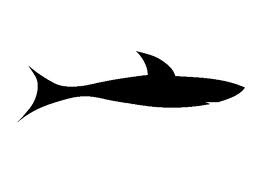
1. Parallel evolution. Subject different designs to the same evolutionary forces and demands, and they will evolve similar solutions. The classic example used to illustrate this phenomenon is the similar shape of sharks, dolphins and F-15 fighter planes.

 Fish, mammal, machine, all evolved to be able to hunt, track and kill moving at high speed through a resistant medium.
In the advertising world, parallel evolution means: give reasonably competent creative teams working on different brands the same brief, stuffed with the same "insights" from asking the same questions to the same focus groups in Paramus, subject their work to the same testing methodology, and you will get more or less the same results, arrived at independently, no copying involved.
That's why you typically see this type of imitation in work within the same category, and usually in a category where there's a lot of research and testing. It's why you'll see four different campaigns for diabetes products, all of which have people in the ads saying "I took control." Listen to enough patients suffering from diabetes say "I don't feel in control of my life" and that's what happens.
2. Agency-driven imitation. This is an ugly subject but ripoffs happen.Walk down the halls of any large agency creative department and you will see someone feverishly flipping through recent One Show and CA annuals looking for "inspiration." The thinking usually runs along the line of, Well this ad won an award for a mountain bike brand. If I use it for my small regional BtoB office supply account, what's the harm?
Besides which, we changed the original Franklin Gothic to Meta Bold!
This is not good, but it has its evil counterpart in reason number three:
3. Client-driven imitation. If you haven't been in a situation where a client has said to you, "Give me something just like that Old Spice guy on the horse," you haven't been in the business long enough. Rough-around-the-edges clients who didn't go to corporate finishing school or who are so senior or so rich they don't give a shit, will tell it to you that blatantly. The MBA types are a little more subtle: they'll send you a link or a clip of ad they like. They'll causally drop a reference to the fact that their boss, or their boss's boss, thinks the new Snickers campaign is great, and if the next round of work doesn't show the product logo being used in a playful, iconic way, they'' drop another hint. Eventually, someone in agency management will dope-slap the creative team and the imitative campaign will be dutifully presented...and bought.
4. Something in the water. The last reason similar ads, or similar approaches to graphic design problems crop up has nothing to do with anything as obvious as the desire to copy or moving with the herd. It is something more mysterious, more ineffable and--because it doesn't just affect advertising but also fashion, art and science, much more interesting. Interesting enough to deserve its own post, which hopefully will appear soon.
